In 2017, Kion was born in a tiny garage in Boulder, CO.
We didn’t have much, but what we did have was a big dream to help people live joyful, active lives.
Today, we’ve come a long way...
Thanks to you, our loyal customers, we’ve been able to grow. To improve. To evolve into a better version of ourselves.
And now, we’re excited to share that evolution with you…
That’s right, friends. Kion got a makeover. And we have to say...we’re looking good.
Here's the scoop on the new rebrand, what's changed, what hasn't, and what it all means.
Why We Rebranded
Our name, Kion, comes from the root word Ki (\ ˈkē \).
Ki is a Japanese term with many meanings, but is often translated as “spirit, or vital energy."
This energy—Ki—is what we wanted the new brand to illustrate.
Our new branding is a visual representation of the essence of Kion: Energetic, playful, full of life. And 100% committed to delivering you clean, science-backed products.
What's Changed?
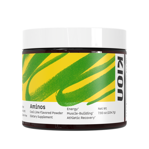
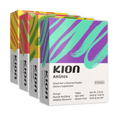
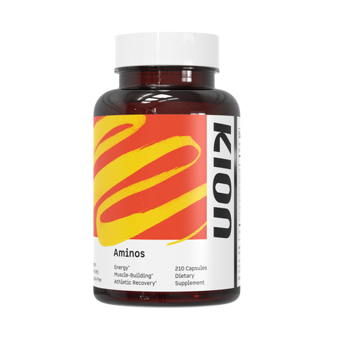
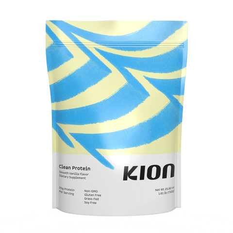
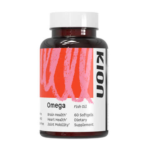
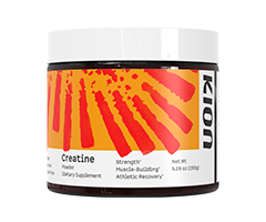
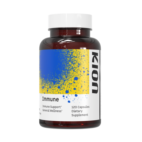
In short, the visuals: Our packaging, logo, colors, fonts, and overall look.
Some of our packaging is also now more eco-friendly and sustainable. Here are the improvements we’ve made:
We switched our packaging to PET.
- PET is more often successfully recycled and has a lower carbon footprint than other plastics. It also has a lower overall carbon footprint than glass (due to weight, extra packaging required, and recycling restrictions in some areas). The new packaging is also BPA-free.
We chose a more eco-friendly label adhesive.
- Our labels now use a removable adhesive, which requires less chemical solvents to remove and speeds up the recycling process.
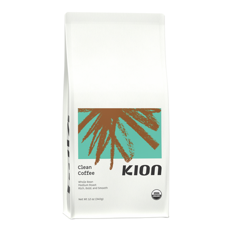
Our new coffee bags are made from 100% renewable materials.
- We chose a new coffee bag that not only preserves the freshness of our coffee, but is also more eco-friendly. The new coffee bags are made of renewable wood pulp and sugar-based materials. There are no fossil fuels involved in production, and the entire process leaves a negative carbon footprint.
The environmental impact of our products and packaging will continue to be an ongoing discussion. We’re diligently working on phased plans to continue to decrease our environmental impact and improve the sustainability of our products.
What Hasn't Changed?
Everything inside the package!
All Kion products are still the same clean, science-backed formulas. Our commitment to quality and your health will never change.
We’re still steeped in science and nature. We just look a little cooler now.
What Does the New Branding Mean?
Here’s what we changed visually, and what it all means.
Logo: The new logo exemplifies energy. It’s active, playful, and bold. It has a movement to it; it’s leaning forward, going somewhere.

Energy Markings: These are the pieces of hand-drawn “abstract art” you’ll notice across our branding. The markings represent the unique energy we all possess as humans. Each product has its own energy marking, like a human fingerprint.

Color: Our color palette has widely expanded to brighter, more vibrant hues. The variety of color allows us to explore all the emotions of the human experience: Energetic, joyful, serious, somber, and everything in between.
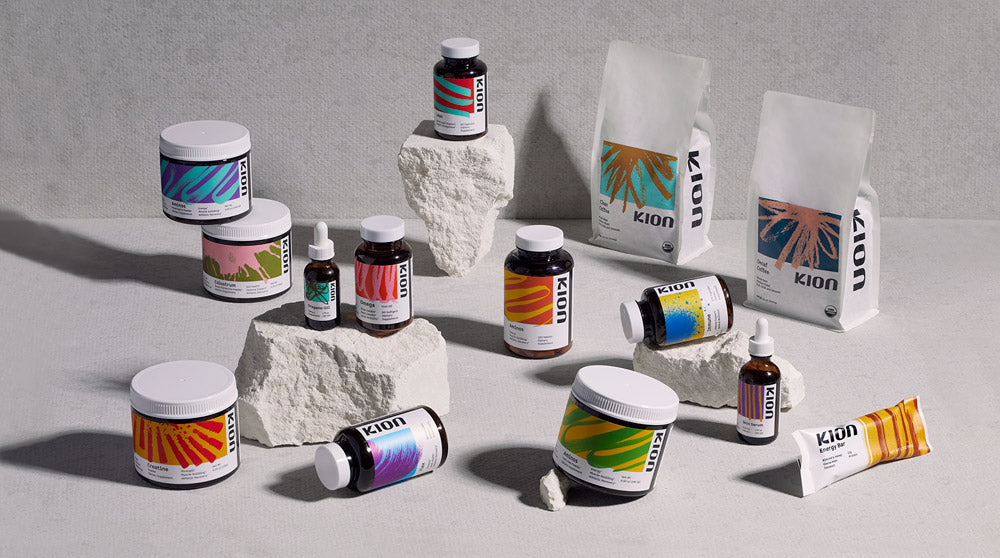
We want to give a huge thank you to the creators behind the new brand.
Creative vision, design, and mad genius magic by Karl Hébert at Gold Lunchbox.
Product and lifestyle photography by Caleb Kerr.
And to the Kion team members that helped bring it to life: Kristina Muntean, Rachel Davidson, Kelsey Hess, Ben Nutt, Amber Hosek, Jordan Callahan, Kirk Youngdahl, Jake Perrin, and Carlotta Herzog.
Thank you for joining us for this new chapter in Kion's story. We hope you love it as much as we do!
Love and Ki,
Team Kion



Comments
A fresh, engaging look on an industry-leading brand. The product has always been top-notch, now I hope the aesthetics helps spread the love to fellow health nuts!
Anonymous on
Awesome, looks great!
Gary Monroe on
Great looks! Love what you’re trying to do for the environment. Maybe someday you’ll be a B-Corp.
I trust every product you come out with. Awesome quality! Thanks 🙏
Anonymous on
Congratulations on all the success leading up to your rebrand. It’s not an easy thing to accomplish. Great job. Your bars – I can’t live without em. THANK YOU!
Shevon on
The new branding & art work is so eye catching. Love that you have adopted a more environmentally friendly packaging. My favorite Kion products will look stunning lined up in my pantry 😁
Anonymous on